Lay Leadership Infographic
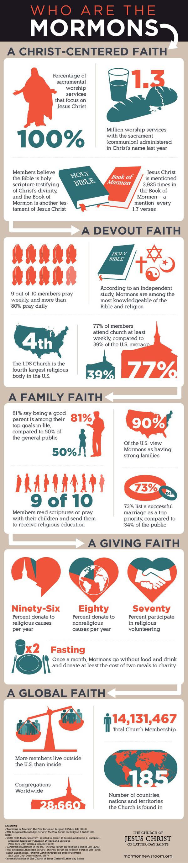
As someone who certainly hasn’t shied away from criticizing how the LDS church treats women, I just wanted to say: I don’t think it’s all that bad.
I agree that the graphic has strategically tweaked a few things to make LDS lay leadership appear more egalitarian than it is. Namely, it has:
- Entirely omitted the (usually) all-male Priesthood Executive Committee.
- Depicted the Ward Council as having equal numbers of men and women, when it almost always has quite a few more men than women (something like 9:3 or 10:3).
- Combined the Elders Quorum Presidency with the High Priests group leaders into a bizarrely-labeled “Lay Priesthood Presidency” to make it seem like there’s parity between the number of men’s quorum leaders and the Relief Society Presidency. It may also be incorrect in lumping the adult men’s quorums in with “ward auxiliaries.” (Elder’s Quorum is considered an “auxiliary”? Can anyone fill me in on this and I’ll update this post accordingly?)
But other than that? I actually think it’s a decent graphic. Even with what’s presented, it’s pretty clear that there are far more male leadership positions on a local level than there are female leadership positions, and that women ultimately serve under the direction of men. It’s even clear that women are limited to primarily ministering to other women and children. I don’t take any issue with the size of the bishopric and stake presidency boxes or their positions.
It’s much more accurate than the last infographic that the LDS church put out, which played pretty fast and loose with statistics.
Categories:

Comments
Lay Leadership Infographic — 13 Comments